Configure the offers you want to display on the website based on your requirement. The customers can make a choice from a wide range of offers available for your product or service.
Handy Tips
By default all the Offers which are marked visible on the Dashboard during the offer creation will appear on the widget.
By default, all those offers which had the 'Show Offer on Checkout' option enabled during creation will appear on the widget.
You can display a particular offer that did not have the 'Show Offer on Checkout' option enabled using the following code:
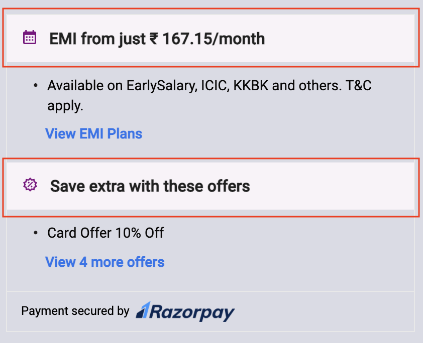
If you have special offers for your product or service, it is a good idea to highlight those on the widget. Highlighting the hero offer will attract more customers and influence their purchase decision.
By default, all those offers which had the 'Show Offer on Checkout' option enabled during the offer creation will appear on the widget. In case you want to display limited offers on the widget, enter the offer_id of the offers of your choice.
To show limited offers:
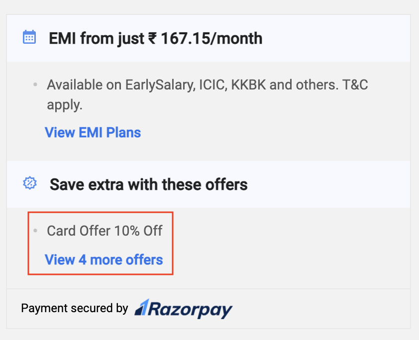
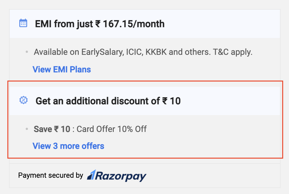
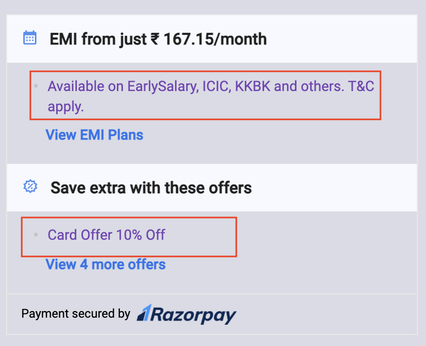
Display the exact amount of discount on offers to help new customers compare and choose your products over your competitors, giving you a foot in the door.
If you disable the offers completely, they will not appear on the widget and the customers will not be able to view them.
To completely disable the offers:
Handy Tips
All EMI options applicable for the payment amount will appear on the widget by default. For example, if the payment amount is ₹3000, the widget displays only the suitable EMI options.
Razorpay supports these providers for EMI options. By default, all EMI options satisfying the minimum transaction amount will appear on the widget. In case you want to display limited EMI options on the widget, enter the list of provider codes based on your requirement.
To show a limited set of providers:
If you disable the EMI options completely, they will not appear on the widget and the customers will not be able to view them.
To completely disable EMI options:
Handy Tips
All Cardless EMI options applicable for the payment amount will appear on the widget by default. For example, if the payment amount is ₹3000, the widget displays only the suitable Cardless EMI options.
Razorpay supports these providers for Cardless EMI options. By default, all Cardless EMI options satisfying the minimum transaction amount will appear on the widget. In case you want to display limited Cardless EMI options on the widget, enter the list of provider codes based on your requirement.
To show a limited set of providers:
If you disable the Cardless EMI options completely, they will not appear on the widget and the customers will not be able to view them.
To completely disable Cardless EMI options:
Handy Tips
All Pay Later options applicable for the payment amount will appear on the widget by default. For example, if the payment amount is ₹4000, the widget displays only the suitable Pay Later options.
Razorpay supports these providers for Pay Later options. By default, all Pay Later options satisfying the minimum transaction amount will appear on the widget. In case you want to display limited Pay Later options on the widget, enter the list of provider codes based on your requirement.
To show a limited set of providers:
If you disable the Pay Later options completely, they will not appear on the widget and the customers will not be able to view them.
To completely disable Pay Later options:
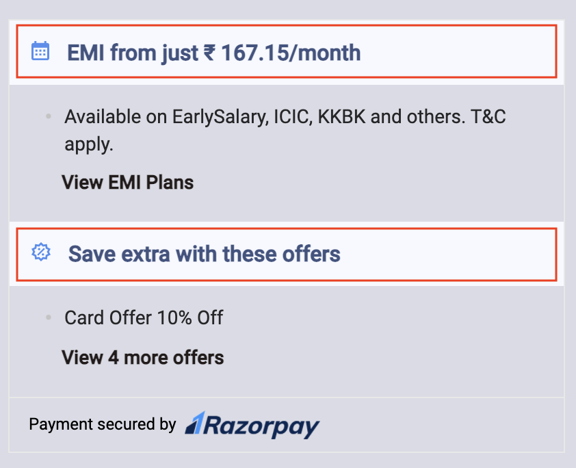
Customise the theme colour based on your requirement. For example, if the background colour of the header is blue, you can change the colour to purple.
Handy Tips
The default theme colour (blue) set on the widget will be considered if no colour is passed here.
You can customise the colour and font size of the headings on the widget. For example, if the colour of the heading is black and the font size is 10px you can change the colour to blue and the font size to 16px.
Handy Tips
The default colour (black) and font size set on the widget will be considered if nothing is passed here.
You can customise the colour and font size of the content on the widget. For example, if the colour of the content is black and the font size is 10px you can change the colour to purple and the font size to 16px.
Handy Tips
The default colour (black) and font size set on the widget will be considered if nothing is passed here.
You can customise the colour and font size of the link on the widget. For example, if the colour of the link is blue and the font size is 10px you can change the colour to black and the font size to 12px.
Handy Tips
The default colour (blue) and font size set on the widget will be considered if nothing is passed here.
You can customise the colour and font size of the footer on the widget. For example, if the colour of the link is black and the font size is 10px you can change the colour to brown and the font size to 12px.
Razorpay provides a customisation option for the logo in two variants:
Light
Dark (default)
Handy Tips
The default colour, font size and Razorpay logo set on the widget will be considered if nothing is passed here.
To change the footer colour, font size and logo:
Copy{
"key": "YOUR_KEY_ID",
"amount": 100000,
"display": {
"widget": {
"main": {
"footer": {
"color": "white",
"fontSize": "12px",
"darkLogo": false// true is default show black text rzp logo
}
}
}
}
}